New Zealand House
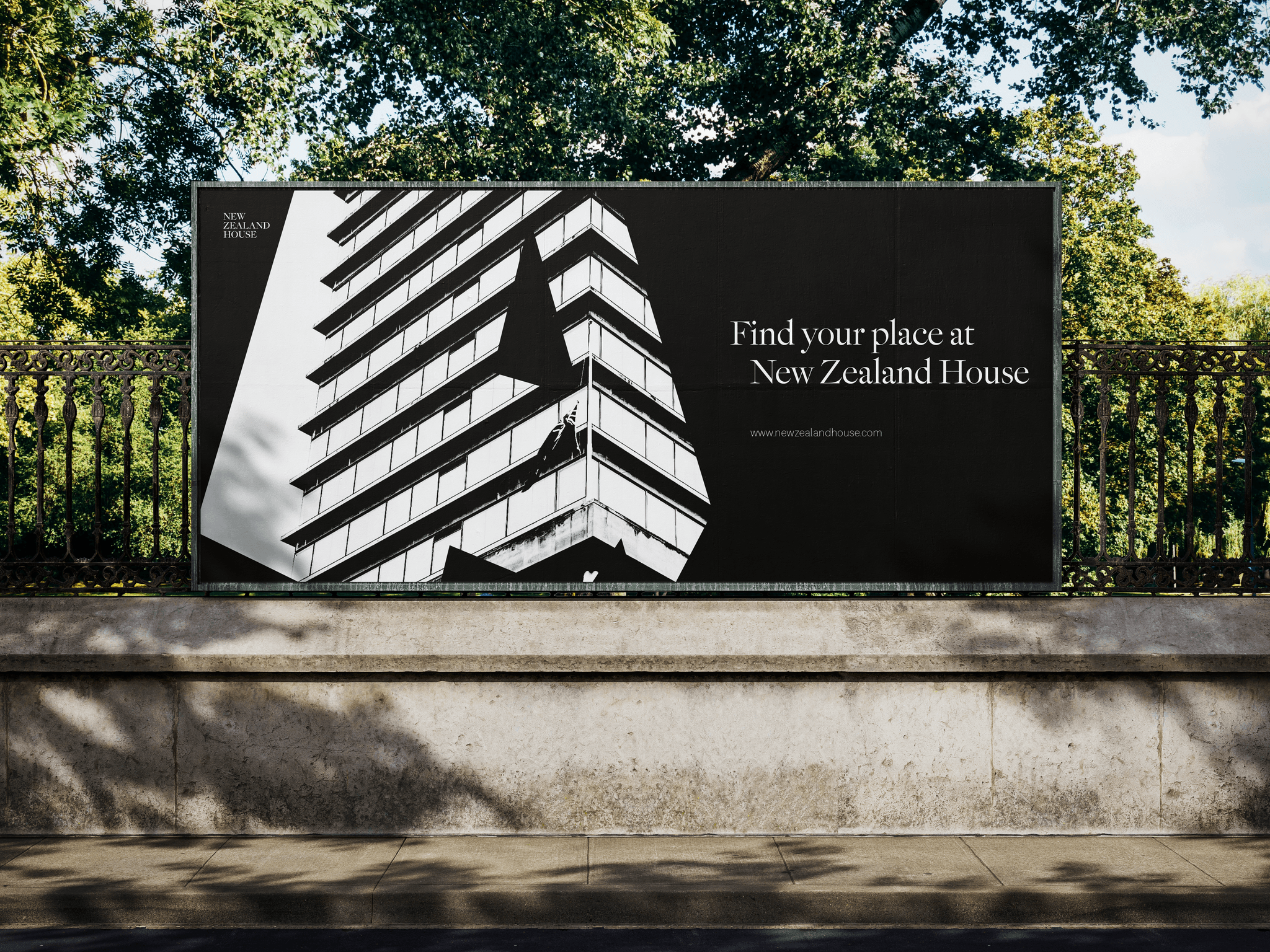
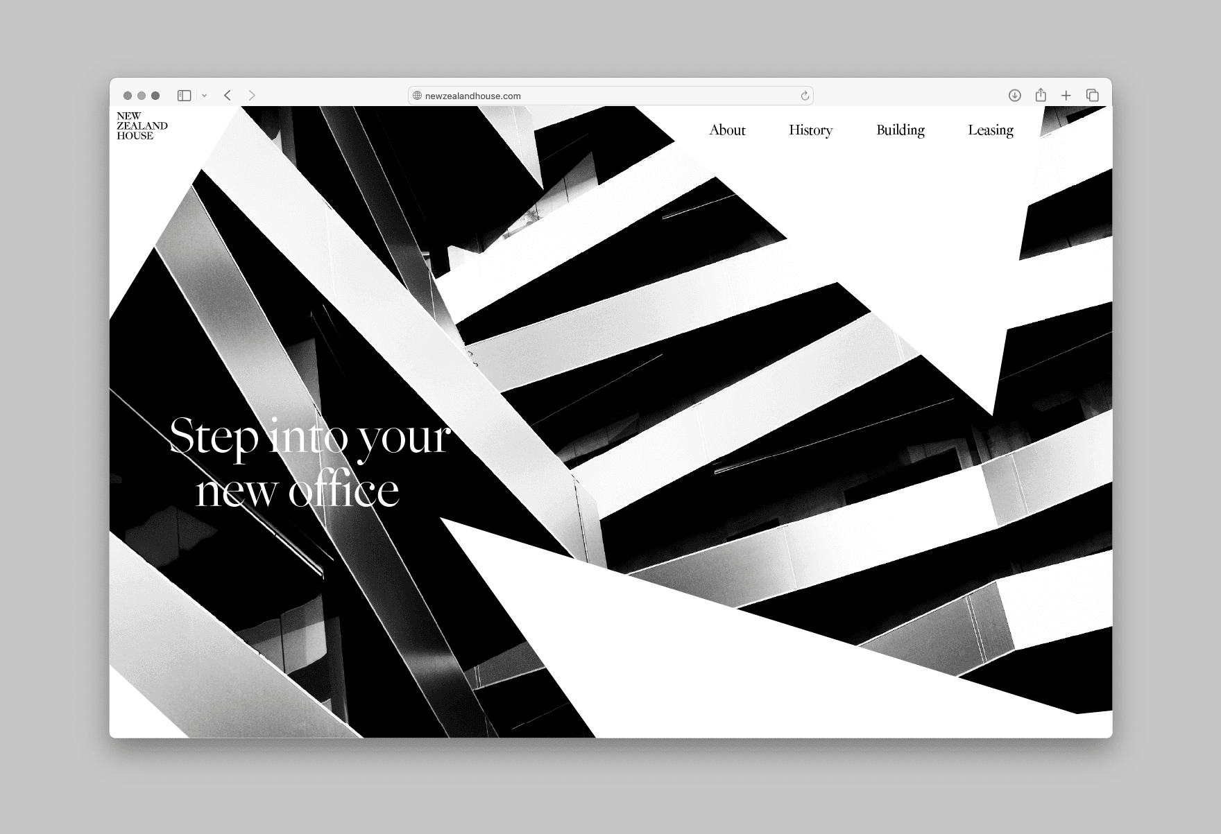
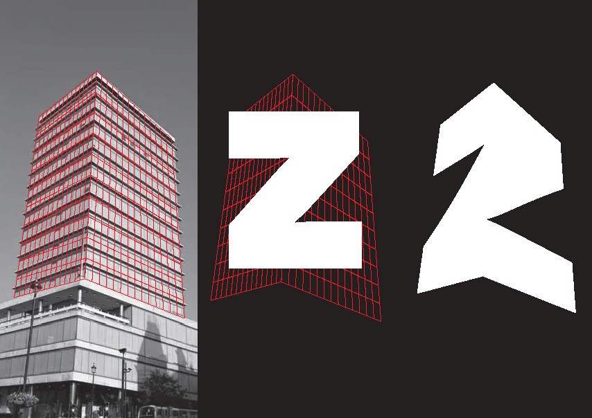
How do you revitalise an icon? New Zealand House in Haymarket was London's first major office tower; sleek, tall and glassy, seen as both controversial and progressive when it opened in the 1960s. The refurbishment began in 2021 and will house the New Zealand High Commission alongside 138,000 sq ft of office space. This concept had to work for a building that is two things at once: a modernist landmark, and a physical symbol of the relationship between New Zealand and the United Kingdom. The identity is built from the architecture itself. Abstract holding shapes are formed by wrapping National 2 around 3D projections of the structure, with a strong black and white palette drawing out the modernist, geometric forms of the building. Both typefaces come from New Zealand foundry Klim, reinforcing the cultural connection, with the fine details of Epicene headings offsetting the bold geometry of the shapes. The result is clean, pared back and adaptable, carrying the building's history in its construction. Grounded in the past, looking forward. Developed as a brand concept.
Type
Brand
Date
2024