Dal Fiorentino
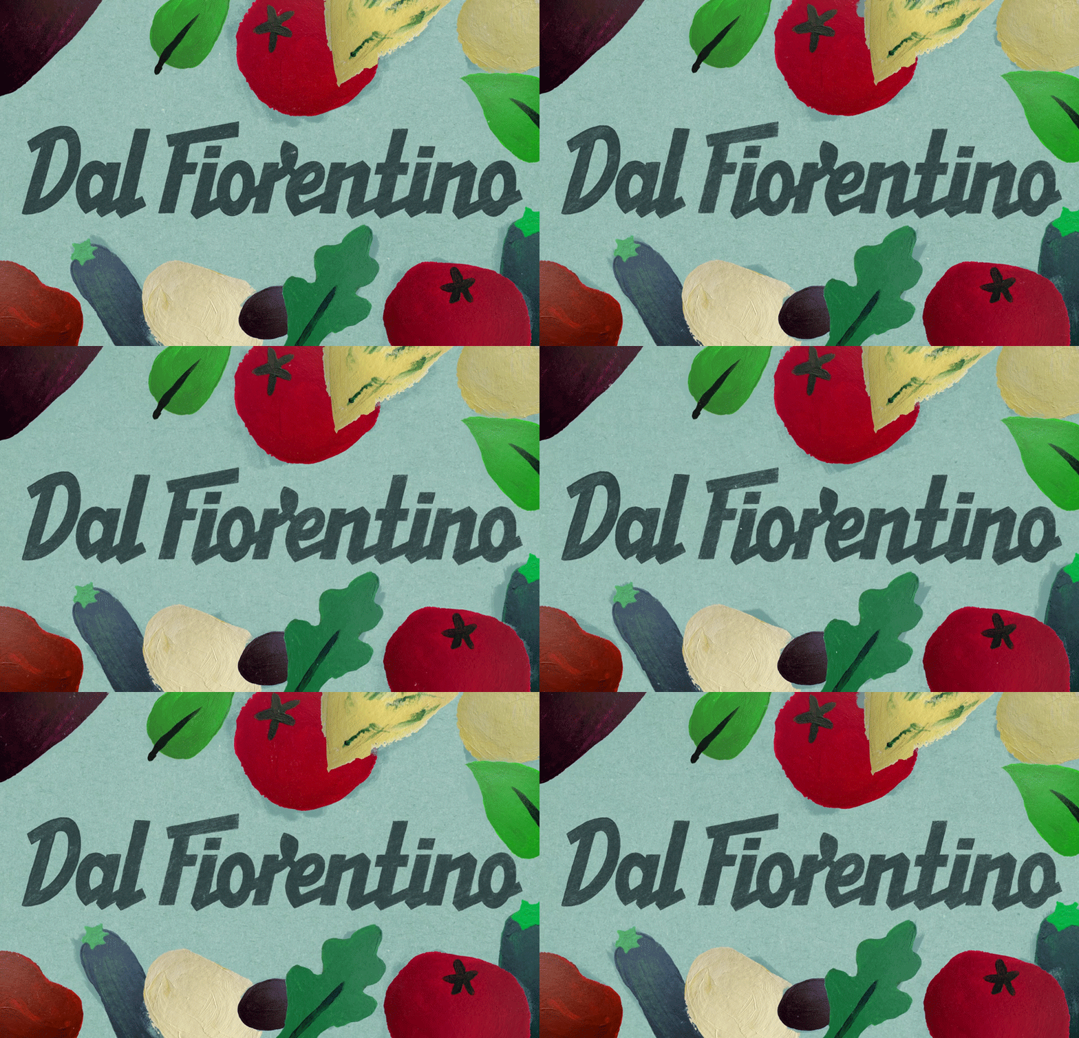
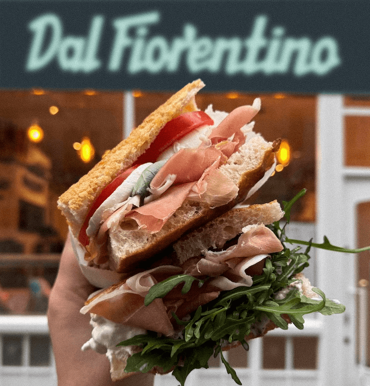
How can you make a sandwich shop feel like Florence? Dal Fiorentino is London's schiacciata specialist, baking Tuscan bread daily and filling it with quality ingredients and homemade Italian sauces. The founders started the business to bring the food they grew up with to London, but as they expand, their brand wasn't fully showcasing that point of view. Pulling to the surface what's already there: the character and warmth of a family-run Florentine restaurant. It should feel like Florence, not Italy in general - the understated elegance of sun-faded streets, a history of craftspeople, and food built on humble ingredients and a thrifty "nothing is thrown away" mentality. The logo draws from Italian sign writing: eccentric, expressive and a little off kilter, while Alfredino Semirounded and Neue Montreal Squeezed keep the typography functional for information-heavy layouts, anchoring the more expressive elements. The colours are sun-faded and the illustrations are scanned in to keep the texture and imperfections, with a secondary riso-printed set supporting the main suite and the tomato and rocket becoming the brand icons. Each has a set of alternates, so they never feel copy and pasted, and a mix of frame-by-frame and digital motion keeps the handcrafted feel throughout. Together these work as a set of ingredients rather than a fixed lockup; type carrying the information across menus and signage, illustration carrying the personality across packaging, merch and OOH. Developed as a brand concept.
Type
Brand
, Animation
Date
2026